
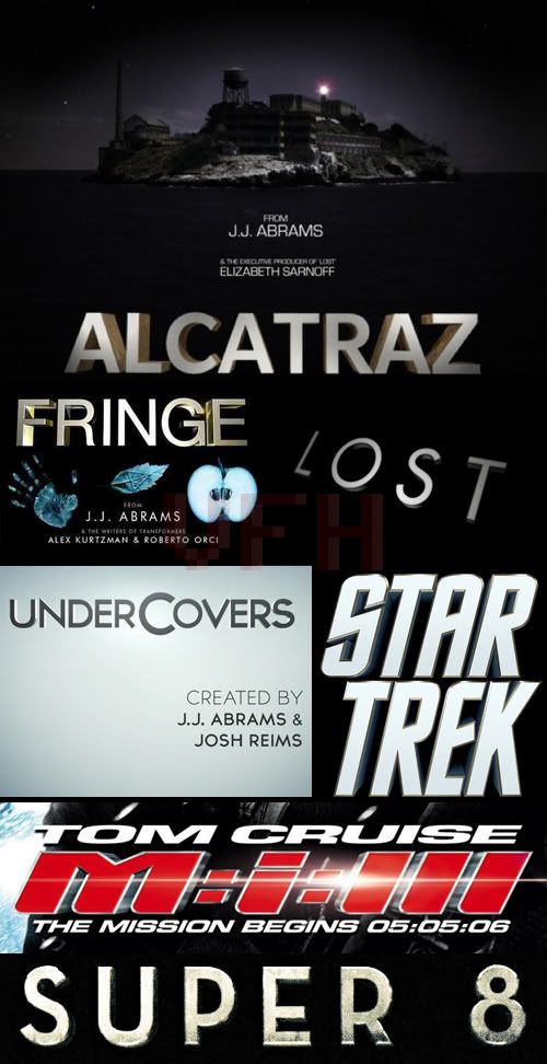
It seems like Mr. Abrams has a thing for metallic 3D font, and he's used it in nearly all of his projects starting with Lost in 2004. I'm not sure if it's a conscious choice by him, or he has the same designer doing logo work for all his projects, but seriously, try something different!
Also, I love that the Mission: Impossible: III logo has lense flair, despite that not even being a joke until 3 years later when Star Trek came out.


1 comment:
agreed.
But doesn't he make the title sequences himself?
I know he made the Lost one, and the title music too.
At least it gives him a signature, or identity from a glance.
Post a Comment