
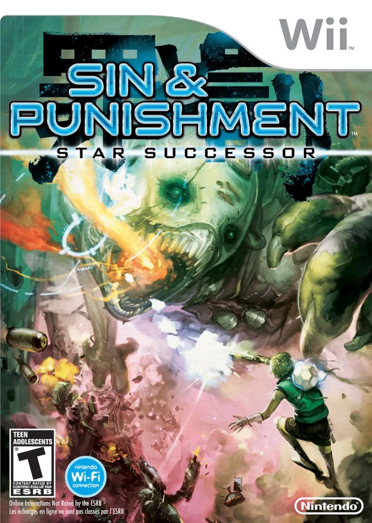
I might not be a fan of the name change, but hot damn, Nintendo at least got the boxart right. I honestly can't think of any games in recent memory that went the route of not slapping the lead character(s) in the center of the package, or using a color pallet of about four colors. This just goes completely against the norm and it's absolutely stunning.
Just to compare, here's a collection of boxart for top-notch games, with not so exciting boxart:
Just to compare, here's a collection of boxart for top-notch games, with not so exciting boxart:
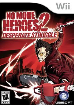
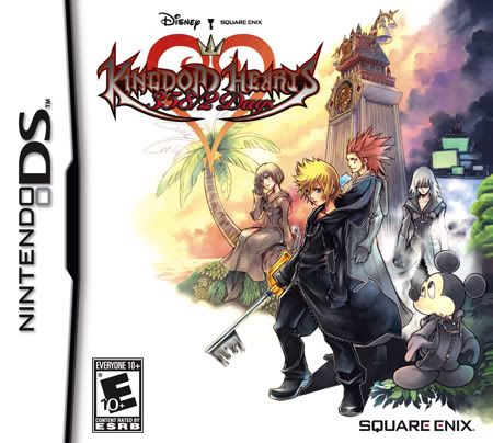

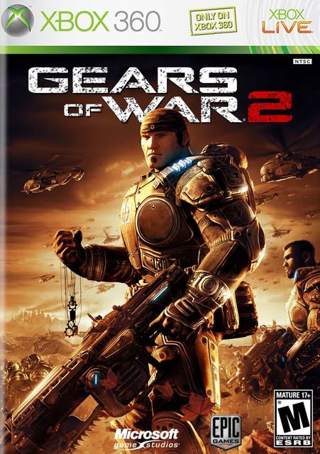

Just look at these for instance, all reasonably high-profile games, and yet all their boxart is either made up a limited color selection, or the main character is HUGE and generally in the center. And then Sin & Punishment: Star Successor shows up, comepletely breaking the formula, and it's gorgeous. As I lover of the first game (thank you Virtual Console) I look forward to the sequel when it releases this June.


No comments:
Post a Comment