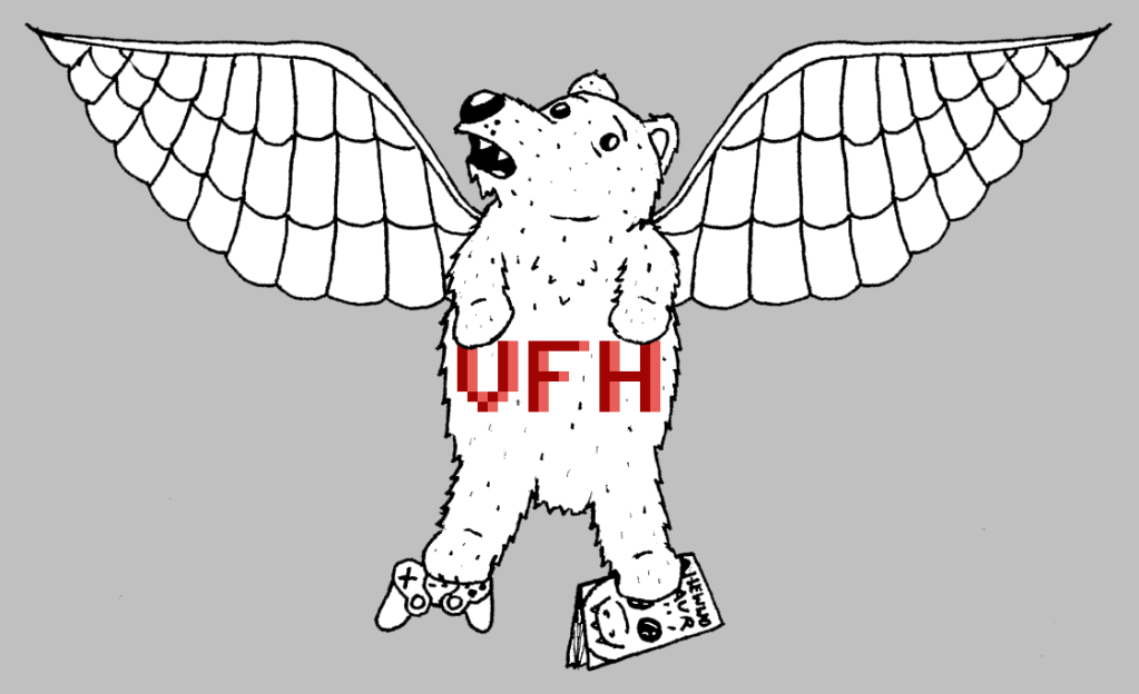
Probably doesn't seem that different, but compare this with the original design.

See it now?
Essentially, the big difference is the left wing (Viewbear's right) which I now duplicated from the right side so that it's symmetrical, and so our mascot doesn't constantly look lopsided. Also, the line art is truly black now, and not in the shades of pen scanned on paper...
Do you like it? Better, because I'll be updating all of our social media pages' backgrounds with the updated image. However, the Seal of Approval will retain its current Viewbear, for "retro" purposes I suppose.
UPDATE: I have changed our MySpace, Facebook, Twitter, and YouTube pages to reflect the new design. And despite what I said, the Seal of Approval also got a fix up. Hope you like it!


No comments:
Post a Comment